Details
By: Clifton Grefe, Web & Digital Media Design student at Madison College.
Time: Started October 3 and finished October 30.
Process
Task: Redesign the app that I had created for previous UX / UI class. I came up with the name and concept.


Problem: I do not like how green and gradient heavy the first version of the app was. The icons became too abundant after adding them in for each store item on top of those for the UI. The Pacifico font is fun and that’s what I was going for but this time around I’m looking for a more serious, studious, curious tone.
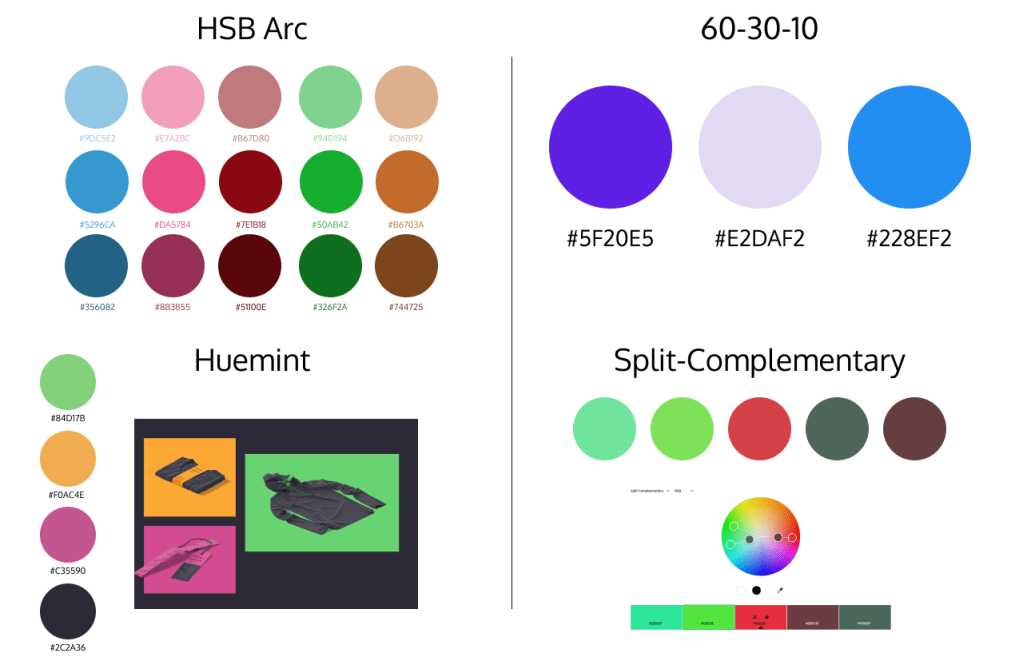
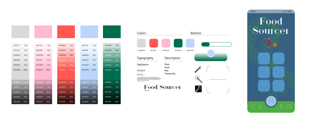
Solution: I experimented with color palettes and that helped a lot. Same with the font choices. I decided on Judson and Geller Sans and those look like they’re working more fluidly.
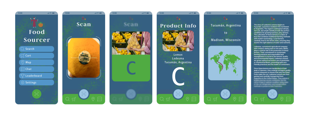
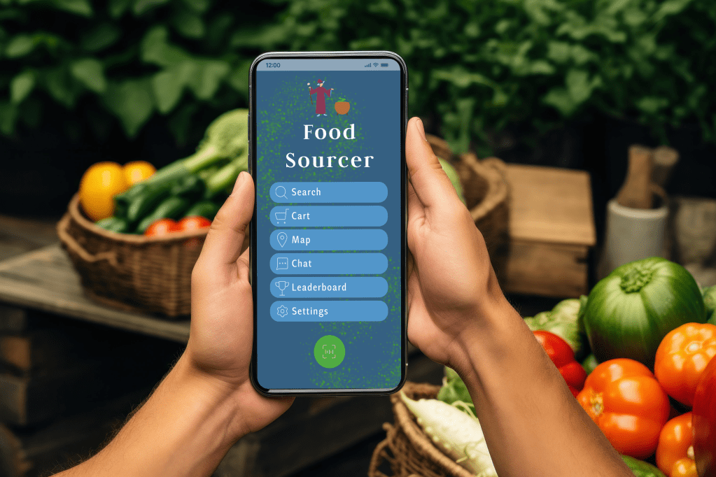
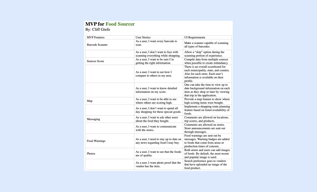
Pitch: With the Food Sourcer application, shoppers can scan a food product barcode at the grocery store and find detailed background information on the item in seconds. They can continue scanning items into their virtual shopping cart as they make their way around the grocery store, and when finished shopping, the collective data is compiled to calculate an overall “Sourcer Score” based on how natural and efficient the person is shopping in accordance with food sourcing criteria. Contributing factors include geographic food source location, additives, processing time, and travel costs.
Madison is the capital of Wisconsin – a state widely known for its agriculture. The city has also been ranked more consistently as one of the healthiest cities in America in recent years. Dane County hosts America’s largest producer-only farmer’s market. Madison has several colleges and attracts young, technologically-sound people from around the world. All of these are factors as to why the Food Sourcer App would be a sensational hit – not only in Madison – but Wisconsin, and the larger Midwest.